 are a number of devices used in the interior of the Hagia Sophia including classic proportioning, materials, murals, and so forth, however, height and light stand in my opinion as the most important. From the exterior, the spaces rise in sequence until the nave with the highest point at the central dome. This in itself is not enough to produce the unique awe of the building, but add the windows, not in an obvious arrangement to maximize openness and light but, in the contrary, so that their light and openness serve to accentuate the darkness and solidity of the highest spaces, including the central dome -- an architectural counterpoint. Height nor light obtain their fullest potential (or, perhaps, understanding, in a spiritual sense) yet, being so close acheiving thier potential, the overall effect is one of amazing grandeur and mystery.
Showing posts with label space design. Show all posts
Showing posts with label space design. Show all posts
Saturday, April 2, 2011
20
Zonification: Whereas post 16 points out that the size of a space in plan is the essential attractive force in circulation, zonification is the overall quality of a space. The primary qualitative driving forces are changes in heights, mostly of the ceiling, and brightness of a space. Other charactaristics can come into play, such as flooring material. Although qualitative, as is true with magnets, with some interpretation by the designer, zonification should be relatively quantifiable. For simplicity, this post discusses the two common types of zonification: vertical openness and brightness. Vertical openness is the sense of space gained through sight lines above eye level. The greater the sense of largess in a space as a result of zonification, to greater the tendency for it to attract individuals. The most common of example is with ceiling height. Balconies, clerestories and skylights can also influence vertical openness. Brightness tends to have a similar effect as vertical openness. Zonification touches on another aspect of the architectural plan: spatial zones. Spatial zones refers to the geometric arrangement of spaces, in plan, for the purpose of creating a sense of enclosure, space, and place. Zonification is linked to spatial zones in that it usually most effectively used when done in conjunction with spatial zones -since ceiling height, vertical openness, and light can be key to creating a sense of enclosure, space, and place. The Hagia Sophia is a wonderful example (perhaps one of the word's best) of the use of zonification. My personal experience with the building interior was one of great awe, and it is my sense that most who walk into the building are overtaken by its power during their procession from the exterior to the nave, as I was. There  are a number of devices used in the interior of the Hagia Sophia including classic proportioning, materials, murals, and so forth, however, height and light stand in my opinion as the most important. From the exterior, the spaces rise in sequence until the nave with the highest point at the central dome. This in itself is not enough to produce the unique awe of the building, but add the windows, not in an obvious arrangement to maximize openness and light but, in the contrary, so that their light and openness serve to accentuate the darkness and solidity of the highest spaces, including the central dome -- an architectural counterpoint. Height nor light obtain their fullest potential (or, perhaps, understanding, in a spiritual sense) yet, being so close acheiving thier potential, the overall effect is one of amazing grandeur and mystery.
are a number of devices used in the interior of the Hagia Sophia including classic proportioning, materials, murals, and so forth, however, height and light stand in my opinion as the most important. From the exterior, the spaces rise in sequence until the nave with the highest point at the central dome. This in itself is not enough to produce the unique awe of the building, but add the windows, not in an obvious arrangement to maximize openness and light but, in the contrary, so that their light and openness serve to accentuate the darkness and solidity of the highest spaces, including the central dome -- an architectural counterpoint. Height nor light obtain their fullest potential (or, perhaps, understanding, in a spiritual sense) yet, being so close acheiving thier potential, the overall effect is one of amazing grandeur and mystery.

Saturday, July 31, 2010
17
Impermeable Barrier:
An impermeable barrier as it relates to human circulation is one in which the ability to move or see beyond the barrier is fully inhibited. Generally this would include an inability to see beyond the barrier's top or the bottom, but would not necessarily include seeing the horizontal ends of the barrier. The most common example of an impermeable barrier would be a full height partition or wall within a building that contains no impassable openings or screens and is not made with translucent or transparent materials, such as a partition constructed of gypsum board attached to wood studs.
This blog's early circulation diagrams are assumed to be using impearmeable barriers. Impermeable barriers have the tendancy to move the eye away from them, and thus, a person moving through a space will have a tendancy to move away from impermeable barriers. An example of this tendancy would be an individual who more or less walks down the center of a corridor. If there are no other individuals or objects to avoid, and the walls on either side are more or less the same, from my observation, the natural tendancy would be for an individual to center themself between the walls on either side. And according to this post, it would be because the individual would tend to move away from the two walls on either side with the same intensity.
This post is a sort of counterpoint to post 16, which discussed how individuals tend to move toward's open spaces.
An impermeable barrier as it relates to human circulation is one in which the ability to move or see beyond the barrier is fully inhibited. Generally this would include an inability to see beyond the barrier's top or the bottom, but would not necessarily include seeing the horizontal ends of the barrier. The most common example of an impermeable barrier would be a full height partition or wall within a building that contains no impassable openings or screens and is not made with translucent or transparent materials, such as a partition constructed of gypsum board attached to wood studs.
This blog's early circulation diagrams are assumed to be using impearmeable barriers. Impermeable barriers have the tendancy to move the eye away from them, and thus, a person moving through a space will have a tendancy to move away from impermeable barriers. An example of this tendancy would be an individual who more or less walks down the center of a corridor. If there are no other individuals or objects to avoid, and the walls on either side are more or less the same, from my observation, the natural tendancy would be for an individual to center themself between the walls on either side. And according to this post, it would be because the individual would tend to move away from the two walls on either side with the same intensity.
This post is a sort of counterpoint to post 16, which discussed how individuals tend to move toward's open spaces.
Sunday, June 20, 2010
15
The Plan is the generator.
Without a plan, you have lack of order, and willfulness.
The Plan holds in itself the essence of sensation...
The eye observes, in a large interior, the multiple surfaces of walls and vaults; the cupolas determine the large spaces; the vaults display their own surfaces; the pillars and the walls adjust themselves in accordance with comprehensible reason. The whole structure rises from its base and is developed in accordance with a rule which is written on the ground in the plan... A profound projection of harmony; this is architecture...
The plan is not a pretty thing to be drawn, like a Madonna face; it is an austere abstraction; it is nothing more than an algebrization and a dry-looking thing. The work of mathematicians remains none the less one of the highest activities of the human spirit.
-Le Corbusier; Towards a New Architecture
The movement of individuals through spaces is primarily determined by the plan. Le Corbusier, in his discussion of the plan, was mostly speaking in abstract terms of the importance considering the plan in three aspects: geometric clarity, contemporary construction, and contemporary socioeconomic factors. This blog has concerned itself, so far, with the arguably more abstract study of human circulation through spaces, as analyzed in plan. It may seem at first blush that Le Corbusier and this blog are approaching the plan in completely different ways. However, it may not be stated outright by early modernists such as Le Corbusier, but I believe this blog touches upon underlying concepts which were inspiring these individuals on a more intuitive level. That is, I am simply digging deeper into holes already started.
Architects, generally speaking and where the luxury of financial resources allows, will spend time in the earliest phases of design work using a variety of diagrams or simple tools of analysis as aids in generating a plan. One popular tool is to illustrate where individuals will circulate through a building. This is often done with lines, arrows, or shaded areas placed over a plan. The downside of these approaches, in my experience, is that they primarily serve to communicate the architect's intention, and have less to do with aiding the architect in their design. So far, this blog has focused on circulation in much the same regard; that is, it has illustrated how individuals may move through a space as a reaction to physical features. To move another step towards a dialog between how individuals move through spaces and how to design spaces for individuals to move through, drawing plans from the point of view of how individuals perceive space would be helpful.
As Le Curbusier states, the plan is an abstraction, which it is, though I might also use the word diagram. Like a plan of action can be efficiently abstracted into a flow chart diagram, so can an architectural plan. The flow in this case, human circulation, can be looked at as a reaction to the local physical features within the field of an individual’s vision. These physical features define spaces for an individual based on what the individual sees, and thus a person is attracted to or guided by these physical features from one space, or area, to another, or within a space or area. For diagrammatic purposes, physical features can be abstracted into six primary elements:
Without a plan, you have lack of order, and willfulness.
The Plan holds in itself the essence of sensation...
The eye observes, in a large interior, the multiple surfaces of walls and vaults; the cupolas determine the large spaces; the vaults display their own surfaces; the pillars and the walls adjust themselves in accordance with comprehensible reason. The whole structure rises from its base and is developed in accordance with a rule which is written on the ground in the plan... A profound projection of harmony; this is architecture...
The plan is not a pretty thing to be drawn, like a Madonna face; it is an austere abstraction; it is nothing more than an algebrization and a dry-looking thing. The work of mathematicians remains none the less one of the highest activities of the human spirit.
-Le Corbusier; Towards a New Architecture
The movement of individuals through spaces is primarily determined by the plan. Le Corbusier, in his discussion of the plan, was mostly speaking in abstract terms of the importance considering the plan in three aspects: geometric clarity, contemporary construction, and contemporary socioeconomic factors. This blog has concerned itself, so far, with the arguably more abstract study of human circulation through spaces, as analyzed in plan. It may seem at first blush that Le Corbusier and this blog are approaching the plan in completely different ways. However, it may not be stated outright by early modernists such as Le Corbusier, but I believe this blog touches upon underlying concepts which were inspiring these individuals on a more intuitive level. That is, I am simply digging deeper into holes already started.
Architects, generally speaking and where the luxury of financial resources allows, will spend time in the earliest phases of design work using a variety of diagrams or simple tools of analysis as aids in generating a plan. One popular tool is to illustrate where individuals will circulate through a building. This is often done with lines, arrows, or shaded areas placed over a plan. The downside of these approaches, in my experience, is that they primarily serve to communicate the architect's intention, and have less to do with aiding the architect in their design. So far, this blog has focused on circulation in much the same regard; that is, it has illustrated how individuals may move through a space as a reaction to physical features. To move another step towards a dialog between how individuals move through spaces and how to design spaces for individuals to move through, drawing plans from the point of view of how individuals perceive space would be helpful.
As Le Curbusier states, the plan is an abstraction, which it is, though I might also use the word diagram. Like a plan of action can be efficiently abstracted into a flow chart diagram, so can an architectural plan. The flow in this case, human circulation, can be looked at as a reaction to the local physical features within the field of an individual’s vision. These physical features define spaces for an individual based on what the individual sees, and thus a person is attracted to or guided by these physical features from one space, or area, to another, or within a space or area. For diagrammatic purposes, physical features can be abstracted into six primary elements:
- Impermeable Barrier, such as a solid floor-to-ceiling wall.
- Permeable Barrier, such as low partition, a screen, or furniture. Note, by permeable, I mean visual permeance.
- Magnet, which is a point of interest such as a work of art, sculpture, or a window with a view.
- Precipice, such as window wall or balcony looking out at a spectacular view. This is essentially a hybrid of the magnet and barriers above except in the sense that they are inextricable with one another.
- Zonification, such as a change in height of ceiling or change in floor material. This covers elements which define zones but which do not necessarily prevent passage.
- Occupancy, such as an expected line of people, or clearance for someone’s legs in front of a bench. This will usually affect space in a similar way as a permeable barrier, except that occupancy is dynamic.


Friday, October 2, 2009
14
In the last post, I mentioned that it may appear that the static uses in a floor plan are secondary to the circulation. This is true from square footage perspective, but perhaps more accurately, the design of a floor plan could be viewed as a dialog between the physical features and the circulation between the physical features. They each inform each other. The diagram in this post is intended to assist in illustrating this postulate. If all human-made features are removed from a floor plan analysis by studyin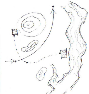 g a natural landscape, a couple obvious facts might be observed; that is, there are still physical features, and if people were to walk the landscape, they would walk somewhere, thus circulation. Essentially, there is no escaping a predetermined context and a predisposed circulation pattern within the context. In the diagram, I sketched a landscape that allowed for circulation through a natural landscape, from a start point to an end point (the solid line). For the sake of the diagram, the two rectangles, representing human-made structures, do not exist for the people walking the solid line path; these people are simply migrating through the particular portion of the natural landscape shown. The dots at the beginning and end of the line are to illustrate the start and destination points. Although this diagram represents a small portion of a greater landscape, and the solid line a part a greater circulation pattern, every single turn in a path can be seen as having a beginning and an end, or a starting point and a destination (this is an analytical tool I will discuss in more detail at a later time). The solid line might more or less represent how a trail might form. However, if the landscape were to change, based on human-made structures, this could greatly alter the general circulation in the area. The two rectangles, being structures, and the dashed line, being the circulation between these structures, illustrate this point. The structures may have been placed in the shown locations for a variety of reasons, including the possibility that the solid line became a well established egress route and that the buildings were required to be some distance from the route. So, the solid line was purely reactive to a natural context and, in turn, the placement of the structures responded to the circulation pattern defined by the solid line, which resulted in a new circulation pattern, and so on. It's impossible to escape history and nature in architecture. Even the orientation of your own home has a causal link from our hunter-gatherer days.
 g a natural landscape, a couple obvious facts might be observed; that is, there are still physical features, and if people were to walk the landscape, they would walk somewhere, thus circulation. Essentially, there is no escaping a predetermined context and a predisposed circulation pattern within the context. In the diagram, I sketched a landscape that allowed for circulation through a natural landscape, from a start point to an end point (the solid line). For the sake of the diagram, the two rectangles, representing human-made structures, do not exist for the people walking the solid line path; these people are simply migrating through the particular portion of the natural landscape shown. The dots at the beginning and end of the line are to illustrate the start and destination points. Although this diagram represents a small portion of a greater landscape, and the solid line a part a greater circulation pattern, every single turn in a path can be seen as having a beginning and an end, or a starting point and a destination (this is an analytical tool I will discuss in more detail at a later time). The solid line might more or less represent how a trail might form. However, if the landscape were to change, based on human-made structures, this could greatly alter the general circulation in the area. The two rectangles, being structures, and the dashed line, being the circulation between these structures, illustrate this point. The structures may have been placed in the shown locations for a variety of reasons, including the possibility that the solid line became a well established egress route and that the buildings were required to be some distance from the route. So, the solid line was purely reactive to a natural context and, in turn, the placement of the structures responded to the circulation pattern defined by the solid line, which resulted in a new circulation pattern, and so on. It's impossible to escape history and nature in architecture. Even the orientation of your own home has a causal link from our hunter-gatherer days.
Thursday, September 24, 2009
13

Circulation:
So far, this blog has concerned itself primarily with human circulation through spaces. It is typical to plan a building by first determining its spatial requirements through the needed static uses (eg. classroom, office, so on). Although this is critical in determining client goals, for spatial planning purposes, it is important to note that most of the space in a building is used for moving through and between the spaces, and not for it's static uses. Additionally, it is the static use that is typically subordinate to the circulation, if the building is to be designed to take advantage of our natural movement tendencies, as discussed in post 12.
Take the image to the right as an example. There are major circulation paths through the space from entrances and exits. This space is assumed to be part of a large public building, say a mall, and the upper left corner of this particular area is planned as a seating area.
First, the seating area was placed in the upper left corner because, after looking at the circulation patterns from the entrances and exits of the space, the upper left corner was the largest remaining contiguous area outside of the circulation paths. The image shows easy circulation from each of the entrances into the waiting area. The couches in the seating are are situated only where the circulation does not exist. I also placed a sign guide, and an electronic screen, in the voids between circulation paths.
Therefore, the seating area location was determined after the main area circulation was analyzed, and the furniture locations were determined after the circulation from the entrances to the seating area was determined.
This approach may appear reactive; that is, the spaces are resulting only from the circulation. However, the circulation will be designed as well as the static uses between.
Thursday, September 17, 2009
12
Sight:
Sight is an integral factor in an individual's determination of how they move through space. Without sight, of course, the sensory input required for moving through space is radically different. There are some observable changes in our society to account for the blind, such as sound ques at crosswalks and surface texture changes intended as warnings or guides, as is the case near the edge of the station platforms in the New York City subway system. If most of us were without sight, I do not doubt that our built physical environment would be radically different, and would probably have a focus on sounds, odors, and texture.
Being that the vast majority do have sight, visual information is our primary guide, with the other senses taking on a fraction of the importance. And, as I have maintained throughout this blog, it is the form of the space itself that can guide individuals by virtue of how it is perceived by those passing though the space, through their vision. Alasdair Turner and Alan Penn explore this notion in their paper Encoding natural movement as an agent-based system: an investigation into human pedestrian behaviour in the built environment. They state:
People might, for example, follow a map, or signage, take into account the direction other people are taking, a glimpse of a familiar painting, reject a route on the grounds of personal prejudice against a style, and so on. On the other hand, the possibility of exploring the walkable surface of the layout ahead (the rooms of the gallery) may simply be enough for a human to do exactly that. If this is the case, we should be able to reproduce movement levels within [a] gallery by using an agent-based model, with movement rules based solely on building configuration, without recourse to models involving learned paths, goals, or destinations, or any more detailed social theory framework.
Sight is an integral factor in an individual's determination of how they move through space. Without sight, of course, the sensory input required for moving through space is radically different. There are some observable changes in our society to account for the blind, such as sound ques at crosswalks and surface texture changes intended as warnings or guides, as is the case near the edge of the station platforms in the New York City subway system. If most of us were without sight, I do not doubt that our built physical environment would be radically different, and would probably have a focus on sounds, odors, and texture.
Being that the vast majority do have sight, visual information is our primary guide, with the other senses taking on a fraction of the importance. And, as I have maintained throughout this blog, it is the form of the space itself that can guide individuals by virtue of how it is perceived by those passing though the space, through their vision. Alasdair Turner and Alan Penn explore this notion in their paper Encoding natural movement as an agent-based system: an investigation into human pedestrian behaviour in the built environment. They state:
People might, for example, follow a map, or signage, take into account the direction other people are taking, a glimpse of a familiar painting, reject a route on the grounds of personal prejudice against a style, and so on. On the other hand, the possibility of exploring the walkable surface of the layout ahead (the rooms of the gallery) may simply be enough for a human to do exactly that. If this is the case, we should be able to reproduce movement levels within [a] gallery by using an agent-based model, with movement rules based solely on building configuration, without recourse to models involving learned paths, goals, or destinations, or any more detailed social theory framework.
In their paper Mr. Turner and Penn go on to explore this notion through computer modelling, and illustrate the high similarities between their model and actual movements. Although, there are many possible methods that may be employed for guiding individuals through a series of spaces, including those mentioned by Mr. Turner and Penn; however, assuming it is practical to design a building so that the physical form itself is a guide, through the perspective of an individual's vision, then I am suggesting that this is a primary design principle in determining how spaces transition into one another, when practical.
Thursday, July 2, 2009
11
In the last post I illustrate a winding path that was appropriate for a semi-public space. In post 8 and 9 I indicated that the layouts of a network of space can influence an individual's velocity.
Certain things can contribute to slowing the pace of individuals. The tighter the required turn the more one will be slowed. The more turns are required, the more an individual's pace will be slowed. The more constrained a threshold from one space to the next, the more an individual's pace will be slowed. Doorways, stairs and ramps will slow an individual's pace. Of course, points of interests, options, and activities will slow an individual's pace. The last point is more applicable to individuals open to being distracted.
Conversely, the more constraints, obstacles, turning or meandering, or distractions are removed from a space, the faster an individual will tend to move.
The English word corridor is derived from the Italian word corridore, or its infinitive verb root correre, meaning to run.
Certain things can contribute to slowing the pace of individuals. The tighter the required turn the more one will be slowed. The more turns are required, the more an individual's pace will be slowed. The more constrained a threshold from one space to the next, the more an individual's pace will be slowed. Doorways, stairs and ramps will slow an individual's pace. Of course, points of interests, options, and activities will slow an individual's pace. The last point is more applicable to individuals open to being distracted.
Conversely, the more constraints, obstacles, turning or meandering, or distractions are removed from a space, the faster an individual will tend to move.
The English word corridor is derived from the Italian word corridore, or its infinitive verb root correre, meaning to run.
Tuesday, June 30, 2009
10

Deconstructing Flow: Assuming there are applicable guidelines to a comfortable turn, as indicated in post 9, as well as items in other posts, these guidelines can be combined to extract resulting human flows in a myriad of different conditions. Take the situation illustrated. Two identical adjacent rooms accommodating the semi-public velocity of an individual. If the individual's movement velocity is appropriately assumed, an individual will meander through these rooms very comfortably.
Thursday, June 25, 2009
9
 The required space to allow for a comfortable 90 degree turn by an individual depends a large part on the velocity of the individual. Reciprocally, the velocity of an individual is influenced by the spatial arrangements of spaces adjacent, and including, the space being analyzed. It is also influenced by the speed at which the individual feels they should move through the space.
To avoid some complexity, the internal motivations of individuals as well as local spatial arrangements can often be determined by the use of a space; such as in the case of an airport, where a speedy pace is commonplace, and accommodated for with the use of large open spatial arrangements that generally flow seamlessly together.
Also, a review of every type of use, and the associated velocity of an individual, may be avoided with three generalized rules of thumb as follows:
In the diagram, I show three turning radii, each representing a natural 90 degree turn in different contexts. Turning radius #1 represents intimate spaces; #2 represents semi-public spaces; #3 represents public spaces, such as an airport. Note the dimensions, which serve to provide some guidelines for actually generating the scale of a space.
These radii, and the corresponding purposes and dimensions I provide, are only guidelines to help simplify the understanding an individual’s velocity and the required space to accommodate their 90 degree turn.
Monday, April 27, 2009
8
People can occupy space by situating themselves in or on objects within a space (such as in a chair), or by situating themselves within the void of the space. When situated within the void of the space, such an occupation may be structured or unstructured. A structured occupation generally arises out of the managed use of a space; unstructured occupation may be a result of the spacial arrangement, but is not necessarily a direct result of the managed use of space. In this diagram a counter is again shown, but it also illustrates a positive example of how structured occupation should be considered in spatial planning.

When entering the space, the user will enter towards the counter. This is functional when the counter is an important stopping point (directing a path of travel towards a meaningful vantage point can be very useful, even if the vantage point isn't also the physical goal).
The left hand side of the counter is for developing one or more lines of people. This is a structured occupation of the space, as it is a result of managing individuals within the space. The projected length and width of the lines is represented by the larger dashed rectangle. The right hand side of the counter is task space. The task space would, of course, be only one individual deep. The task space might be used by people who have already waited in line, and now are filling out paperwork, for example. The smaller dashed rectangle represents the area consumed by people using the task portion of the counter.
The flow diagram shows the path of individuals who bypass the counter and move through to the next space. This layout would be practical in a situation, say, where there is a mix of people who will either stop at the counter, or who will simply proceed through the room; especially where the use of the counter may be particularly important for some individuals.
The arrangement accounts for both the intended managed uses of the space and also for the flow of people passing through the space, and actually, the flow depicted is encouraged, or guided, as a result of the structured occupation (at the lines and the task counter).

When entering the space, the user will enter towards the counter. This is functional when the counter is an important stopping point (directing a path of travel towards a meaningful vantage point can be very useful, even if the vantage point isn't also the physical goal).
The left hand side of the counter is for developing one or more lines of people. This is a structured occupation of the space, as it is a result of managing individuals within the space. The projected length and width of the lines is represented by the larger dashed rectangle. The right hand side of the counter is task space. The task space would, of course, be only one individual deep. The task space might be used by people who have already waited in line, and now are filling out paperwork, for example. The smaller dashed rectangle represents the area consumed by people using the task portion of the counter.
The flow diagram shows the path of individuals who bypass the counter and move through to the next space. This layout would be practical in a situation, say, where there is a mix of people who will either stop at the counter, or who will simply proceed through the room; especially where the use of the counter may be particularly important for some individuals.
The arrangement accounts for both the intended managed uses of the space and also for the flow of people passing through the space, and actually, the flow depicted is encouraged, or guided, as a result of the structured occupation (at the lines and the task counter).
Wednesday, January 14, 2009
6
 Objects in space:
Although my observations of human movement through space at this point are anecdotal, I believe that the essence of the diagrams is accurate. Studies tracing the footsteps of numerous individuals over a period of time would be required to accurately map movement through space. After that, it may be possible that mathematics and computer models may be applied to provide a tool for analyzing designs.
Computer models can be very helpful; however, producing drawings and diagrams manually based on approximations of movement, as part of the design process, is proactive and may be a tool for improving the designer's sensitivity to space.
Individuals will tend to center themselves in space. In this diagram, the view to the exit is clear from the entrance, and theoretically, a person is able to walk in a direct line from the entrance to the exit; however, unless pedestrians make a conscious effort to walk in a straight line, they will tend to move in a slight 's' pattern. Objects within a larger space can have an influence on movement. Short objects will generally influence movement and tall objects will tend to influence movement and sight lines.
There is also an additional influence taking place; that is, individuals will tend to keep a certain distance from objects.
Sunday, December 28, 2008
5
Second time visitor:
In the previous posts (1 - 4), I have been illustrating the natural movement of an individual through a featureless room that is square in plan, has a single exit and entry, and which is about 15' x 15' in area with entries and exits that are about 5' - 8' wide. The spaces leading to the rooms and the spaces beyond the exits are thought to be completely wide and open. In fact, the rooms can be thought of as standing alone in a flat featureless expanse of space; except that for some reason an individual must travel through the space to reach their destination.
With these diagrams I have been illustrating the basic principals of movement through a small room. I have used a small room, not necessarily because they are the most illustrative of walking patterns, but instead because a small room is familiar and thus can be useful as the seed for an understanding of indiduals' complex relationship with space.
As the concepts I have been illustrating are bear the kernel of a rational and theoretical approach to our relationship to space, all of the points in the first paragraph of this post are essential to the results presented in the previous diagrams. Those points act as variables in a mathematical equation, and in this post I introduce one of the variables that I have so far not discussed, but which underlies all of the previous diagrams and which will be relevant to the future posts for the foreseeable future: The second time visitor.
The second time visitor is, for all intensive purposes, a person who enters and/ or passes through a space for the second time. The idea behind this phrase is not intended to literally mean that it applies only to individuals who are traveling through a space for the second time. It is referring to a pedestrian who is neither completely unfamiliar with a space nor who has developed a personal familiarity with the space. It is my assumption that the second time visitor is illustrative of the most intuitive movement through, and between spaces. It is an attempt to reduce movement to an abstract notion by stripping various biases that might influence someone's path of travel. A first time visitor might find themselves distracted by novelties within a space, or with other cultural conventions, to accurately depict someone flowing naturally through a space. On the other hand, someone who is very familiar with a space or series of adjoining spaces may travel by learned routes and shortcuts.
The point of diagramming movement according to the most unbiased individual is to aid in developing spaces that consciously take advantage of our natural tendencies. Although, clever as we are (we can determine more efficient or effective ways of walking through our built environment than what may come intuitively), there are many reasons to have spaces that take into account natural and intuitive movement.
In the previous posts (1 - 4), I have been illustrating the natural movement of an individual through a featureless room that is square in plan, has a single exit and entry, and which is about 15' x 15' in area with entries and exits that are about 5' - 8' wide. The spaces leading to the rooms and the spaces beyond the exits are thought to be completely wide and open. In fact, the rooms can be thought of as standing alone in a flat featureless expanse of space; except that for some reason an individual must travel through the space to reach their destination.
With these diagrams I have been illustrating the basic principals of movement through a small room. I have used a small room, not necessarily because they are the most illustrative of walking patterns, but instead because a small room is familiar and thus can be useful as the seed for an understanding of indiduals' complex relationship with space.
As the concepts I have been illustrating are bear the kernel of a rational and theoretical approach to our relationship to space, all of the points in the first paragraph of this post are essential to the results presented in the previous diagrams. Those points act as variables in a mathematical equation, and in this post I introduce one of the variables that I have so far not discussed, but which underlies all of the previous diagrams and which will be relevant to the future posts for the foreseeable future: The second time visitor.
The second time visitor is, for all intensive purposes, a person who enters and/ or passes through a space for the second time. The idea behind this phrase is not intended to literally mean that it applies only to individuals who are traveling through a space for the second time. It is referring to a pedestrian who is neither completely unfamiliar with a space nor who has developed a personal familiarity with the space. It is my assumption that the second time visitor is illustrative of the most intuitive movement through, and between spaces. It is an attempt to reduce movement to an abstract notion by stripping various biases that might influence someone's path of travel. A first time visitor might find themselves distracted by novelties within a space, or with other cultural conventions, to accurately depict someone flowing naturally through a space. On the other hand, someone who is very familiar with a space or series of adjoining spaces may travel by learned routes and shortcuts.
The point of diagramming movement according to the most unbiased individual is to aid in developing spaces that consciously take advantage of our natural tendencies. Although, clever as we are (we can determine more efficient or effective ways of walking through our built environment than what may come intuitively), there are many reasons to have spaces that take into account natural and intuitive movement.
Subscribe to:
Posts (Atom)