 are a number of devices used in the interior of the Hagia Sophia including classic proportioning, materials, murals, and so forth, however, height and light stand in my opinion as the most important. From the exterior, the spaces rise in sequence until the nave with the highest point at the central dome. This in itself is not enough to produce the unique awe of the building, but add the windows, not in an obvious arrangement to maximize openness and light but, in the contrary, so that their light and openness serve to accentuate the darkness and solidity of the highest spaces, including the central dome -- an architectural counterpoint. Height nor light obtain their fullest potential (or, perhaps, understanding, in a spiritual sense) yet, being so close acheiving thier potential, the overall effect is one of amazing grandeur and mystery.
Saturday, April 2, 2011
20
Zonification: Whereas post 16 points out that the size of a space in plan is the essential attractive force in circulation, zonification is the overall quality of a space. The primary qualitative driving forces are changes in heights, mostly of the ceiling, and brightness of a space. Other charactaristics can come into play, such as flooring material. Although qualitative, as is true with magnets, with some interpretation by the designer, zonification should be relatively quantifiable. For simplicity, this post discusses the two common types of zonification: vertical openness and brightness. Vertical openness is the sense of space gained through sight lines above eye level. The greater the sense of largess in a space as a result of zonification, to greater the tendency for it to attract individuals. The most common of example is with ceiling height. Balconies, clerestories and skylights can also influence vertical openness. Brightness tends to have a similar effect as vertical openness. Zonification touches on another aspect of the architectural plan: spatial zones. Spatial zones refers to the geometric arrangement of spaces, in plan, for the purpose of creating a sense of enclosure, space, and place. Zonification is linked to spatial zones in that it usually most effectively used when done in conjunction with spatial zones -since ceiling height, vertical openness, and light can be key to creating a sense of enclosure, space, and place. The Hagia Sophia is a wonderful example (perhaps one of the word's best) of the use of zonification. My personal experience with the building interior was one of great awe, and it is my sense that most who walk into the building are overtaken by its power during their procession from the exterior to the nave, as I was. There  are a number of devices used in the interior of the Hagia Sophia including classic proportioning, materials, murals, and so forth, however, height and light stand in my opinion as the most important. From the exterior, the spaces rise in sequence until the nave with the highest point at the central dome. This in itself is not enough to produce the unique awe of the building, but add the windows, not in an obvious arrangement to maximize openness and light but, in the contrary, so that their light and openness serve to accentuate the darkness and solidity of the highest spaces, including the central dome -- an architectural counterpoint. Height nor light obtain their fullest potential (or, perhaps, understanding, in a spiritual sense) yet, being so close acheiving thier potential, the overall effect is one of amazing grandeur and mystery.
are a number of devices used in the interior of the Hagia Sophia including classic proportioning, materials, murals, and so forth, however, height and light stand in my opinion as the most important. From the exterior, the spaces rise in sequence until the nave with the highest point at the central dome. This in itself is not enough to produce the unique awe of the building, but add the windows, not in an obvious arrangement to maximize openness and light but, in the contrary, so that their light and openness serve to accentuate the darkness and solidity of the highest spaces, including the central dome -- an architectural counterpoint. Height nor light obtain their fullest potential (or, perhaps, understanding, in a spiritual sense) yet, being so close acheiving thier potential, the overall effect is one of amazing grandeur and mystery.
Sunday, February 6, 2011
19
The Magnet:
A magnet refers to something attractive visually, olfactorily, or audial; usually an object, such as a painting, flowers, sculpture or fountain. These items draw an observer closer with the desire for more to be revealed and, usually, enjoyed (a car wreck would be an obvious exception).
Magnets are not always small objects, however, as they can be things such as an interesting view through a window, or the sound of a waterfall in the distance. For simplicity, for now this blog is only concerned with visual magnets, since they are much easier to analyze in terms of how they might influence an individual's movements, and the most effective method of guiding individuals, with good site, through spaces. That is, an individual will only know of a visual magnet once a clear site line to it is established, and only at that time will individuals tend to move towards the magnet.
As an example of a visual magnet, take a person walking down a sidewalk. Imagine that they suddenly happen upon a small plaza between two buildings. Spatially, the plaza itself could have some attractive force inherent in it (depending on its geometry and the geometry of the surrounding area), but imagine if the plaza had a beautiful fountain in its center. Once the fountain is in the individual's sight, it will have, for all intents and purposes, an attractive force pulling the observer closer to it(whether the person actually moves towards the fountain depends on a number of factors outside the scope of this post).
Sound and smell are much more complex senses in terms of their impact on movement. To illustrate this complexity as it relates to sound, imagine again the scenario above but with the added fact that the fountain is very loud and can be heard from a distance. Since sound will bounce and echo off of solid objects, in a city with buildings in every direction it may appear to the individual that the sound originates across the street, or even from behind. The observer in a dense city, who is dependant on sound to find an object, may easily meander a while before actually locating a loud fountain in a small plaza.
The purpose of pointing out that sound and smell can be magnets in terms of human circulation is primarily to serve as a counterpoint to the important role that sight plays. Although it is not entirely beyond me that this post also opens the door to the possibility that architectural management of the other senses might be done to effectively guide those with limited sight through spaces.
Thursday, January 20, 2011
18
Permeable Barriers: The Permeable barriers pose a much more complex thought challenge than impermeable barriers. It's easy to imagine that people's eyes and movements tend to drift away from large flat uninteresting opaque surfaces. Permeable barriers, however, being physically impassable but allowing some degree of visual access, can encourage wide wide spectrum of behaviours. This spectrum will primarily depend on the character of the visual access, the approach to the barrier, and what lies beyond. Examples of permeable barriers include a wall with windows, window wall, counter, railing, impassible change in level, lattice, shoji screens, glass block, and so forth. Some of these barriers are visually open, some are physically and visually open, and both can be to varying degrees. Shoji screens and a precipice are at opposite ends of the permeable barrier spectrum. The prior being almost impermeable except for ghostly impressions and silhouettes, and the latter allowing for full visual exposure and physical openness. The precipice will actively attract us towards it to be fully embraced with awe, anxiety, or delight, while the shoji screen with silhouetted figures may pique a subdued, intimate, curiosity but may not inspire us to action. Therefore, to avoid too much complexity at the moment, I'll make simple postulate that the greater the visual and physical openness, and the greater the view, the more individuals are attracted to a permeable barrier. The less of each of these ingredients, the more an permeable barrier acts as an impermeable barrier. The approach can also enhance the attractive force of the permeable barrier.
Saturday, July 31, 2010
17
Impermeable Barrier:
An impermeable barrier as it relates to human circulation is one in which the ability to move or see beyond the barrier is fully inhibited. Generally this would include an inability to see beyond the barrier's top or the bottom, but would not necessarily include seeing the horizontal ends of the barrier. The most common example of an impermeable barrier would be a full height partition or wall within a building that contains no impassable openings or screens and is not made with translucent or transparent materials, such as a partition constructed of gypsum board attached to wood studs.
This blog's early circulation diagrams are assumed to be using impearmeable barriers. Impermeable barriers have the tendancy to move the eye away from them, and thus, a person moving through a space will have a tendancy to move away from impermeable barriers. An example of this tendancy would be an individual who more or less walks down the center of a corridor. If there are no other individuals or objects to avoid, and the walls on either side are more or less the same, from my observation, the natural tendancy would be for an individual to center themself between the walls on either side. And according to this post, it would be because the individual would tend to move away from the two walls on either side with the same intensity.
This post is a sort of counterpoint to post 16, which discussed how individuals tend to move toward's open spaces.
Monday, June 21, 2010
16
The Voids:
As Taoists are aware, it is the empty space between physical elements that makes a thing useful. Post 15 focused mainly on how physical features guide an individual; however, the empty, walkable, surface defined by these physical features will have almost as much impact. Generally speaking, assuming a walkable surface is even throughout, these empty areas go by a simple formula: the larger the area relative to surrounding areas, the more it will tend to attract individuals to it.
As Taoists are aware, it is the empty space between physical elements that makes a thing useful. Post 15 focused mainly on how physical features guide an individual; however, the empty, walkable, surface defined by these physical features will have almost as much impact. Generally speaking, assuming a walkable surface is even throughout, these empty areas go by a simple formula: the larger the area relative to surrounding areas, the more it will tend to attract individuals to it.
Sunday, June 20, 2010
15
The Plan is the generator.
Without a plan, you have lack of order, and willfulness.
The Plan holds in itself the essence of sensation...
The eye observes, in a large interior, the multiple surfaces of walls and vaults; the cupolas determine the large spaces; the vaults display their own surfaces; the pillars and the walls adjust themselves in accordance with comprehensible reason. The whole structure rises from its base and is developed in accordance with a rule which is written on the ground in the plan... A profound projection of harmony; this is architecture...
The plan is not a pretty thing to be drawn, like a Madonna face; it is an austere abstraction; it is nothing more than an algebrization and a dry-looking thing. The work of mathematicians remains none the less one of the highest activities of the human spirit.
-Le Corbusier; Towards a New Architecture
The movement of individuals through spaces is primarily determined by the plan. Le Corbusier, in his discussion of the plan, was mostly speaking in abstract terms of the importance considering the plan in three aspects: geometric clarity, contemporary construction, and contemporary socioeconomic factors. This blog has concerned itself, so far, with the arguably more abstract study of human circulation through spaces, as analyzed in plan. It may seem at first blush that Le Corbusier and this blog are approaching the plan in completely different ways. However, it may not be stated outright by early modernists such as Le Corbusier, but I believe this blog touches upon underlying concepts which were inspiring these individuals on a more intuitive level. That is, I am simply digging deeper into holes already started.
Architects, generally speaking and where the luxury of financial resources allows, will spend time in the earliest phases of design work using a variety of diagrams or simple tools of analysis as aids in generating a plan. One popular tool is to illustrate where individuals will circulate through a building. This is often done with lines, arrows, or shaded areas placed over a plan. The downside of these approaches, in my experience, is that they primarily serve to communicate the architect's intention, and have less to do with aiding the architect in their design. So far, this blog has focused on circulation in much the same regard; that is, it has illustrated how individuals may move through a space as a reaction to physical features. To move another step towards a dialog between how individuals move through spaces and how to design spaces for individuals to move through, drawing plans from the point of view of how individuals perceive space would be helpful.
As Le Curbusier states, the plan is an abstraction, which it is, though I might also use the word diagram. Like a plan of action can be efficiently abstracted into a flow chart diagram, so can an architectural plan. The flow in this case, human circulation, can be looked at as a reaction to the local physical features within the field of an individual’s vision. These physical features define spaces for an individual based on what the individual sees, and thus a person is attracted to or guided by these physical features from one space, or area, to another, or within a space or area. For diagrammatic purposes, physical features can be abstracted into six primary elements:
- Impermeable Barrier, such as a solid floor-to-ceiling wall.
- Permeable Barrier, such as low partition, a screen, or furniture. Note, by permeable, I mean visual permeance.
- Magnet, which is a point of interest such as a work of art, sculpture, or a window with a view.
- Precipice, such as window wall or balcony looking out at a spectacular view. This is essentially a hybrid of the magnet and barriers above except in the sense that they are inextricable with one another.
- Zonification, such as a change in height of ceiling or change in floor material. This covers elements which define zones but which do not necessarily prevent passage.
- Occupancy, such as an expected line of people, or clearance for someone’s legs in front of a bench. This will usually affect space in a similar way as a permeable barrier, except that occupancy is dynamic.


Friday, October 2, 2009
14
In the last post, I mentioned that it may appear that the static uses in a floor plan are secondary to the circulation. This is true from square footage perspective, but perhaps more accurately, the design of a floor plan could be viewed as a dialog between the physical features and the circulation between the physical features. They each inform each other. The diagram in this post is intended to assist in illustrating this postulate. If all human-made features are removed from a floor plan analysis by studyin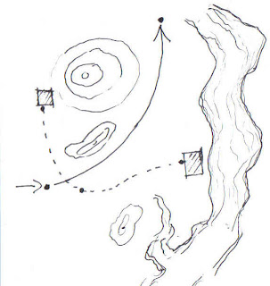 g a natural landscape, a couple obvious facts might be observed; that is, there are still physical features, and if people were to walk the landscape, they would walk somewhere, thus circulation. Essentially, there is no escaping a predetermined context and a predisposed circulation pattern within the context. In the diagram, I sketched a landscape that allowed for circulation through a natural landscape, from a start point to an end point (the solid line). For the sake of the diagram, the two rectangles, representing human-made structures, do not exist for the people walking the solid line path; these people are simply migrating through the particular portion of the natural landscape shown. The dots at the beginning and end of the line are to illustrate the start and destination points. Although this diagram represents a small portion of a greater landscape, and the solid line a part a greater circulation pattern, every single turn in a path can be seen as having a beginning and an end, or a starting point and a destination (this is an analytical tool I will discuss in more detail at a later time). The solid line might more or less represent how a trail might form. However, if the landscape were to change, based on human-made structures, this could greatly alter the general circulation in the area. The two rectangles, being structures, and the dashed line, being the circulation between these structures, illustrate this point. The structures may have been placed in the shown locations for a variety of reasons, including the possibility that the solid line became a well established egress route and that the buildings were required to be some distance from the route. So, the solid line was purely reactive to a natural context and, in turn, the placement of the structures responded to the circulation pattern defined by the solid line, which resulted in a new circulation pattern, and so on. It's impossible to escape history and nature in architecture. Even the orientation of your own home has a causal link from our hunter-gatherer days.
 g a natural landscape, a couple obvious facts might be observed; that is, there are still physical features, and if people were to walk the landscape, they would walk somewhere, thus circulation. Essentially, there is no escaping a predetermined context and a predisposed circulation pattern within the context. In the diagram, I sketched a landscape that allowed for circulation through a natural landscape, from a start point to an end point (the solid line). For the sake of the diagram, the two rectangles, representing human-made structures, do not exist for the people walking the solid line path; these people are simply migrating through the particular portion of the natural landscape shown. The dots at the beginning and end of the line are to illustrate the start and destination points. Although this diagram represents a small portion of a greater landscape, and the solid line a part a greater circulation pattern, every single turn in a path can be seen as having a beginning and an end, or a starting point and a destination (this is an analytical tool I will discuss in more detail at a later time). The solid line might more or less represent how a trail might form. However, if the landscape were to change, based on human-made structures, this could greatly alter the general circulation in the area. The two rectangles, being structures, and the dashed line, being the circulation between these structures, illustrate this point. The structures may have been placed in the shown locations for a variety of reasons, including the possibility that the solid line became a well established egress route and that the buildings were required to be some distance from the route. So, the solid line was purely reactive to a natural context and, in turn, the placement of the structures responded to the circulation pattern defined by the solid line, which resulted in a new circulation pattern, and so on. It's impossible to escape history and nature in architecture. Even the orientation of your own home has a causal link from our hunter-gatherer days.
Subscribe to:
Posts (Atom)